MOKO STUDIO.
[PT/BR]
Sobre
Moko Studio acredita que o design desempenha um papel essencial nas relações humanas e nas experiências emocionais. Mantemos uma convicção pessoal e profissional de que o design e a tecnologia têm o poder de capacitar as marcas a atingirem seu máximo potencial e irradiarem sua energia singular no mundo. Cultivamos relações próximas e comunicativas ao longo de toda a jornada criativa, colaborando estreitamente com nossos clientes e uma rede de talentos parceiros criativos. Isso nos permite conceber projetos abrangentes e personalizados, desde o início até a conclusão.
[EN]
About
Moko Studio believes that design plays an essential role in human relationships and emotional experiences. We maintain a personal and professional conviction that design and technology have the power to empower brands to reach their full potential and radiate their unique energy into the world. We cultivate close, communicative relationships throughout the creative journey, collaborating closely with our clients and a network of talented creative partners. This allows us to design comprehensive, personalized projects from inception to completion.
Moko Studio believes that design plays an essential role in human relationships and emotional experiences. We maintain a personal and professional conviction that design and technology have the power to empower brands to reach their full potential and radiate their unique energy into the world. We cultivate close, communicative relationships throughout the creative journey, collaborating closely with our clients and a network of talented creative partners. This allows us to design comprehensive, personalized projects from inception to completion.
Conceito
[PT/BR]
Sobre
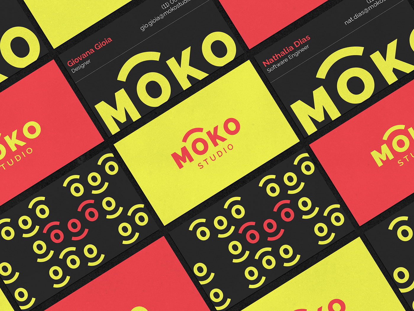
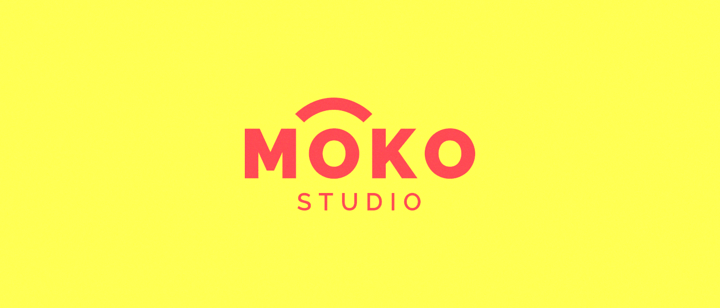
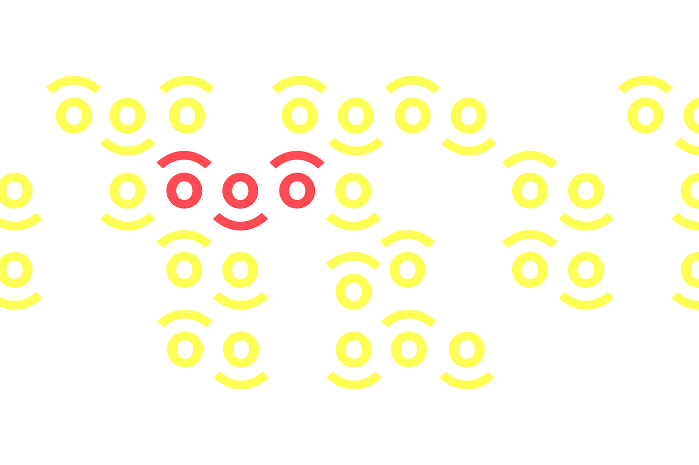
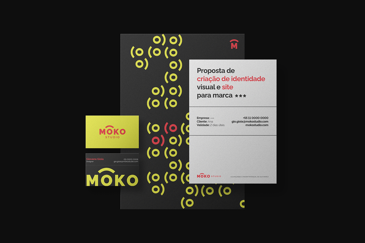
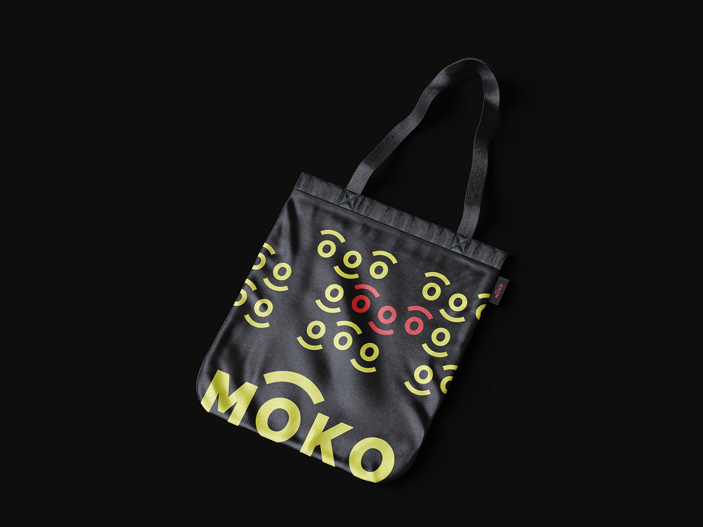
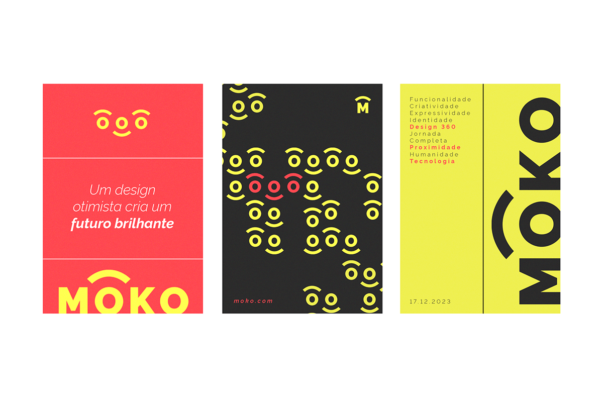
Para a criação da identidade visual, foram utilizadas como base três palavras-chave: proximidade, humanidade e tecnologia. O conceito de proximidade se concretiza na marca a partir do arco apresentado no logo, representando a conexão do cliente com seu objetivo, e também a conexão do estúdio com os objetivos do cliente. O conceito de humanidade é representado nas cores vibrantes e na criação do pattern da marca, onde se é criado um "sorriso", trazendo o caráter divertido e contemporâneo - também presente no briefing. O conceito tecnológico é representado pela fonte escolhida para o projeto - sem serifa e monotype - e também pelo pattern.
[EN]
About
To create the visual identity, three keywords were used as a basis: proximity, humanity and technology. The concept of proximity is embodied in the brand through the arc presented in the logo, representing the client's connection with their objective, and also the studio's connection with the client's objectives. The concept of humanity is represented in the vibrant colors and in the creation of the brand's pattern, where a "smile" is created, bringing the fun and contemporary character - also present in the brief. The technological concept is represented by the font chosen for the project - sans serif and monotype - and also by the pattern.
To create the visual identity, three keywords were used as a basis: proximity, humanity and technology. The concept of proximity is embodied in the brand through the arc presented in the logo, representing the client's connection with their objective, and also the studio's connection with the client's objectives. The concept of humanity is represented in the vibrant colors and in the creation of the brand's pattern, where a "smile" is created, bringing the fun and contemporary character - also present in the brief. The technological concept is represented by the font chosen for the project - sans serif and monotype - and also by the pattern.


Obrigada pela atenção (:

